Background

Kaus, an established insurance company, wants to start selling policies online. They have optimized 350+ packages to simplify the process and provide affordable insurance.

* this was a project from the Design Lab UX intensive - Kaus is not real

Role

UX Designer

Timeline

4 weeks

The Challenge

Create a website that gives the customer an easy way to research and purchase insurance online, while still giving them enough information to make an informed decision.

The Process

01

Research

Competitive Analysis 

Initial Takeaways

• The insurance market has seen a lot of growth within the past few years with net premiums in the US totaling $1.32 trillion. Some companies have increased their funding 60% in an attempt to bolster new research and adopt new technologies to gather data, create accurate risk assessments and ease the process of buying insurance.

• There is a trend to combine AI, automation and APIs to deliver tailored customer experiences, generate faster quotes, quicken the approval process and get claims paid out faster. This is heightening the user experience and also trimming the fat. With no administration overhead or broker fees, you can pass the savings directly to the consumer. Right now is the perfect time for an insurance company to enter the digital space.

1:1 Interviews

I conducted 4 interviews to gather a better understanding of the user’s needs while shopping for insurance. Participant ages ranged between 36 and 72.

Motivations

• Cost was the major factor for 3 of the 4 participants
• Coverage was the other factor
• Those with children were willing to spend more if coverage was better
• All participants wanted to bundle for savings and convenience

Pain Points

• Confusing terminology
• Complicated plans, especially for health insurance
• No easy way to compare plans and options
• Not being viewed as an individual (coverage dictated by customer segments)

02

Define

Project Goals


In-Depth Comp Analysis


I re-examined the competition to see what they offered. This let me see where there were opportunities for Kaus to stand out, like offering the ability to purchase every type of insurance online.

Card Sorting

To get information on how users want to see categories and menus grouped, I used Card Sorting to test 6 participants. Through this exercise, 4 rough categories emerged - Account,  Savings/Rewards, FAQs/Help and Claims (and possibly Emergency).

Sitemap

I was now able to build a rough idea of what the menu system would look like.

User Flow

My User Flow allowed me to see all of the options a user could take throughout the insurance quote and purchase process, complete with alternate entry points and reasons he might exit the site.

03

Ideate

Site Sketches

With the IA figured out, I could move on to the fun part. First, I quickly sketched 3 ideas for the homepage.

Wireframes

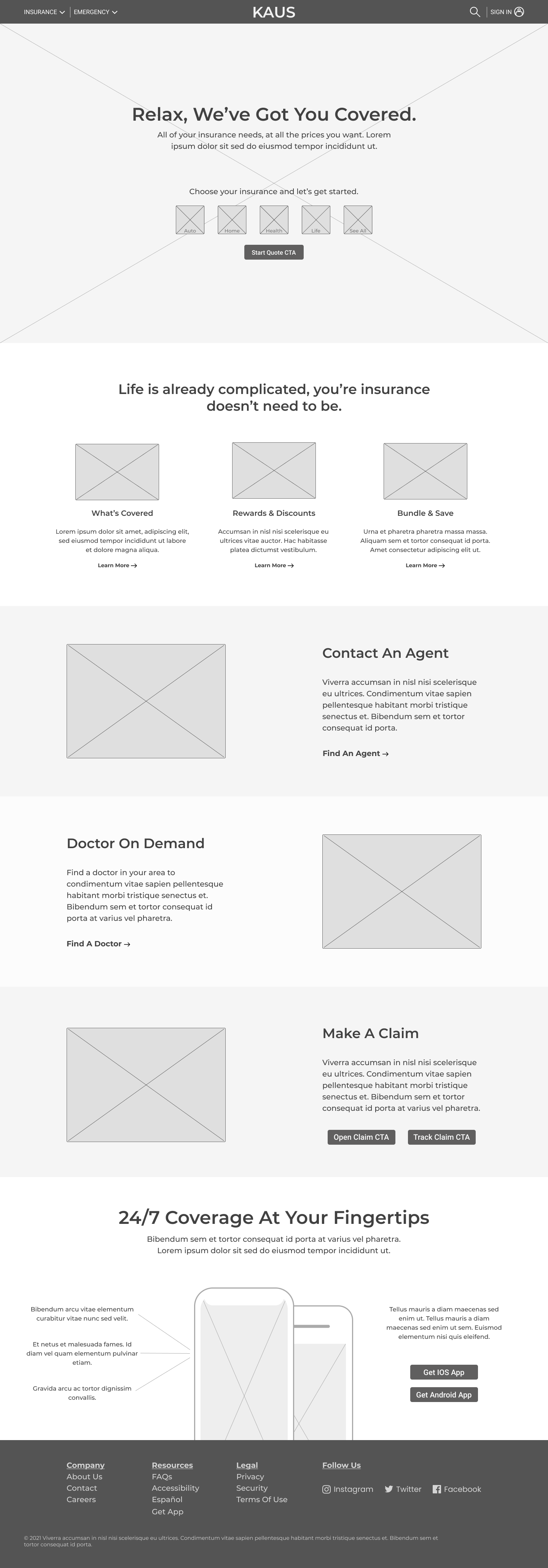
Then I built out wireframes using pieces from my sketches. It gave me an idea of how the site might function and I could see how my IA was laid out. Referencing my interviews and persona, I kept the sections top level and easy to understand. Getting a quote easily was most important and the ability to get more information was only a click away.

Responsive Wireframe

I also knew the site would be used across multiple platforms and devices, so I created wireframes to test some functionality on iPhones.

Lo-Fi Prototype Test

I made more pages to simulate the quote, checkout and account creation processes. This was a deeper dive into the functionality of the site and it gave me a quick way to test task flows.

UI Tool Kit

I created a detailed set of components, fonts and colors to help guide me through the rest of the design process.

04

Prototype

Mid-fidelity Design

I designed the necessary pages to test the user’s ability to get a quote and purchase insurance.

Now I was ready for testing!

05

Test

Usability Test

Background
I recruited 3 participants for testing, 1 male and 2 female between the ages of 36-60.  I conducted two tests remotely and one in person. Each participant was given the same scenario, tasks and questions.

Scenario
You’re a freelance designer and photographer and drive to clients all over your area. Your car just died and you found a good deal on a used one with low miles, so you need insurance ASAP. You’re looking for the lowest cost, but know you may need some extra coverage. Your friend recommended Kaus. She has used them for years, their rates are great and they’ve always come through for her. You’re going to their website to check their prices and get insurance.

Summary Of Findings
   • Overall, participants felt the navigation, CTAs and buttons were functional and made sense.
   • All participants felt the images and illustrations were good, albeit maybe a little generic. 2 commented that the branding didn’t feel strong.
   • 2 of 3 participants started the quote process directly from the home page.
   • 3 of 3 made note that there is no immediate mention of the types of insurance Kaus offers on the homepage.
   • Everyone felt the quote funnel functioned as it should and took in enough information.
   • All participants understood the functionality of the tags on the comparison page, but felt there needed to be a      clearer indication of differences between different coverage types.
   • All participants experienced confusion surrounding the add-on section on the comparison page.
   • 2 of 3 had comments about the Review and Payment section during checkout.

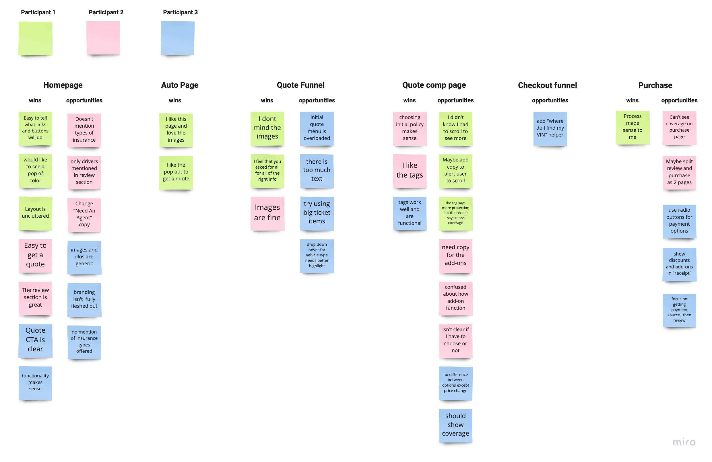
Affinity Map

I took my notes from the usability tests and compiled into wins and opportunities. This gave me a clearer view of high priority problems that may keep the user form easily completing a purchase.

Pain Points Discovered

   • No indication of insurance types offered on homepage
   • Main quote menu is too dense
   • Confusion with add-on functionality
   • Lack of detail between coverage options
   • Review and payment section doesn't function well as one page
   • Overall UI is bland and lacks identifiable brand association

06

Next Steps

Iterate prototype to:

   • Display types of insurance offered in hero on homepage via images or copy.
   • Simplify the main “Get a Quote” option menu to alleviate cognitive load on the user.
   • Assess quote comparison page to clear up confusion and lessen user dropout. This may become two pages,      one for choosing an insurance package that displays coverage and one for add-ons (upsell).
   • Retool the Review and Payment section in checkout to simplify process. This could also become two pages, one      for payment info and one for review and purchase. 
   • Retest prototype for usability.

Takeaways

The insurance world is complicated, as is people’s relationship with it . Creating a product to simplify the process of buying insurance was very challenging. The amount of information, different options and breadth of cognitive overload is at times overwhelming. In that regard, it was nice to get positive feedback about the choices I made regarding functionality and information.

It was also rewarding, in its own way, to see what did not work. Even with all of the research, it’s easy to develop blind spots when you’re working on something so closely. It’s clear to see how important testing fast and often helps the process.

Other projects: 
Viv's Botanicalskin/ish